village rewards
Small brand book
Brand direction · 01
Brand direction · 01
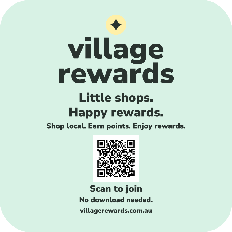
Little shops. Happy rewards.
A little local.
A lot to
smile about.
A cheerful identity for the everyday joy of getting something back from the places you love.
little
wins.big smiles.
wins.big smiles.
01 / The feeling
Make everyday rewarding.
Village Rewards turns familiar local routines into things to look forward to. The brand should feel welcoming on a shop window, easy at the counter and happy in your pocket.
Sunny
Warm colour, optimistic words and small celebrations that make progress feel good.
Playful
Round shapes, chunky numbers, reward stickers and a little surprise in the composition.
Easy
Readable text, clear points prices and one obvious next action. People should know what to do immediately.
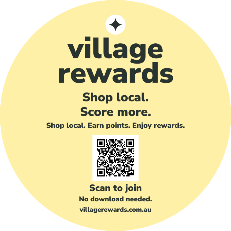
Main line: Shop local. Score more.
Supporting line: Your everyday favourites. Your next little treat.
Supporting line: Your everyday favourites. Your next little treat.
02 / Happy colour
White space. Scoops of colour.
White is the canvas. Butter yellow is the signature. Pink and mint bring variety; peach and sky blue give larger campaigns room to play.
Fresh white
#FFFFFFMain pages, breathing room and clear reward details.
Butter
#FFF0A8Signature moments, highlights and reward stickers.
Candy pink
#FBDCE7Treats, welcome messages and playful campaign panels.
Fresh mint
#D8F2E5Points, progress and completed milestones.
Peach fizz
#FFDFC8Food illustrations and occasional promotional panels.
Blue sky
#DCEEFADiscovery, village trails and supporting information.
Soft charcoal · #29332F
All essential text, icons and primary buttons. White text on charcoal buttons.
All essential text, icons and primary buttons. White text on charcoal buttons.
Starting balance: roughly 60% white, 30% pastel surfaces and 10% charcoal details. Use one dominant pastel per card and usually two per screen. These proportions are a composition guide.
Use charcoal text on every pastel. Reserve pastels for backgrounds, not small lettering. Always pair status colour with words or an icon. Purple is outside this first palette.
03 / Type & mark
Round, bold and readable.
Use Nunito Sans throughout: 900 for short headlines and points, 800 for buttons, 400–600 for body text. Its soft letterforms carry the friendliness while one family keeps everything consistent.
HEADLINES · 900
Hello,
happy days.
happy days.
Short lines. Sentence case. Everyday language.
INTERFACE · 400–800
47 pts
Only 3 points to your next treat.
App sizes: 16px body, 14px supporting text, 24–32px headings, 48–64px points. Keep controls at least 48px tall. Let text wrap and grow when users increase their text size.
village rewards
Working wordmark: lowercase, heavy and friendly. A small four-point sparkle marks a little win. Keep clear space around the mark at least the height of its “v”; use charcoal on white or a pastel. This is a direction for a future logo master.
04 / The fun in the interface
Let the reward do the talking.
Use rounded cards, generous padding and clear labels. Make food and gifts look desirable with simple illustrations or bright, natural photographs.
Your points
47
3 points to a treat.
A specific next milestone makes progress tangible.
Coffee’s on us.
10 points · Example café
Nice one.
Reward unlocked!
You’ve earned a little something. Take a look.
Celebrate after a verified action.
Illustrative interface specimens. Offers and numbers are examples; buttons on this page are visual samples. Emoji stands in for commissioned illustrations.
- Shapes: 24px card corners, 16px button corners and round reward badges.
- Illustration: simple coffee cups, pastries, shopping bags and gifts, with charcoal outlines and pastel fills. Keep the same drawing style throughout.
- Photography: real treats and local shopkeepers, daylight, close crops and uncluttered backgrounds.
- Motion: a brief sparkle or point count-up when points arrive. Aim for 200–400ms feedback; honour reduced-motion settings and show the result immediately.
- Navigation: labelled ☰ Menu in the header. Keep Show my code and Browse rewards visible on Home.
05 / Sound like a friendly local
A little cheek. Lots of clarity.
Use short, warm sentences. Put the useful information first. Save the celebration for good news and make problems easy to resolve.
WELCOMEHey Alex. Good things ahead.
PROGRESS3 more points. One lovely coffee.
POINTS EARNEDNice one. You earned 8 points.
DISCOVERYYour next favourite is around the corner.
EMPTY STATEYour first treat starts with your first shop.
ERRORWe couldn’t load your points. Please try again.
Use “free” only when it is accurate and show any conditions nearby. Keep merchant names, points costs and availability plain. Avoid invented urgency, guilt about missed visits and unexplained loyalty jargon.
06 / At a glance
One happy, recognisable family.
Shop window
Your next treat
starts here.
Join Village Rewards.
Village campaign
Take the
scenic shop.
Discover a new local favourite.
Reward moment
A little win.
Just for you.
See what you’ve unlocked.
Start with white, butter, pink and mint. Let the words and rewards bring the energy. Add peach and blue when the composition needs variety.
07 / Shop window decals
A little happy on the glass.
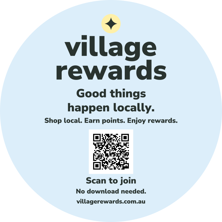
Four colours. Four reasons to stop and smile. Our bold wordmark, a little sparkle and one friendly line make participating shops easy to spot. A QR code invites people to join, with a simple promise: shop local, earn points, enjoy rewards. Pick a favourite for each shop window.
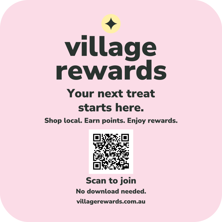
02 / A pink little treat
Your next treat starts here.
Rounded square · 200 × 200 mm
Download vector SVG ↓